Causes of flight delays and cancellations
Living abroad for almost 15 years, I am a frequently seen guest at many airports. Unfortunately, I am regularly facing delayed or even cancelled flights. Who doesn't? I am at the point that I am often surprised if my plane takes off on time and arrives on time. Luckily, international flights have some leverage to make up for lost time by pushing the gas pedal. I believe many people don't realize that flight delays and cancellations put significant strain on the air transportation system and cost airlines, passengers and others millions of dollars each year. The NEXTOR study performed by the University of California Berkeley’s Institute of Transportation Studies found that flight delays and cancellations cost the US economy an estimated 33 Billion dollar each year of which passengers bear ~ 15 billions. One in four flights arrives or departs at least 15 minutes late. What is actually causing these unpopular delays? The weather, a missed start window? Using publicly available data from the Research and Innovative Technology Administration Bureau of Transportation Services (RITA) (limited to August 2014), the overall goal of this project is to investigate the general basis of flight delays and identify airlines and airports with the highest delay rate.
1. To determine airports with the highest number of arriving flights per month
2a. To define the proportion of delayed flights in the U.S. per month (no daily data available)
2b. To investigate the different causes of flight delays
3. To identify airlines and airports with the highest percentage of delayed flights
The data set analyzed in this project contained information for 14 carriers and 316 airports. Only domestic flights were included. A flight is considered delayed when it arrived 15 or more minutes than the schedule. The codes written for this project can be easily modified to accommodate more airlines over consecutive month (ongoing).
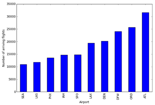
The data can be downloaded as .csv file which makes it nice and handy to read into python using the csv module. First, I decided to look at the total number of arriving flights per airport (here: August 2014). As it turns out, for the included airlines, most planes arrive at Hartsfield-Jackson Atlanta International Airport (ATL) followed by Chicago O'Hare International Airport (ORD) and Dallas/Fort Worth International Airport (DFW). The nice thing about the code is that you can easily parse in a much larger data set and can check out which airports are the most popular ones in the U.S. (either globally or for a given airline).
Bar graph showing airports in the U.S. with the highest number of flight arrivals
Having done a little bit of mapping in the past, it would not be a nice project without including at least some kind of mapping. I picked the top 10 airports, pulled down the lat/lon coordinates and fed them into the function shown below.
I am working on a nicer map. I would love to make the marks proportional to the number of arriving flights. Coming soon!!
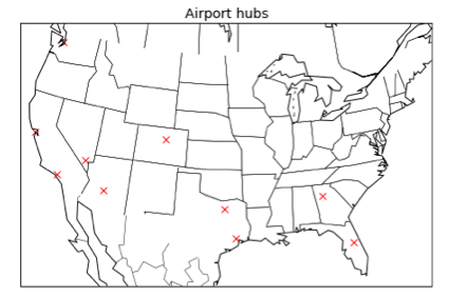
Graphical illustration of the location of the most commonly used airports in the U.S. (14 airlines)
Next, let's mine the data in a way that we get information which helps us understand why airplanes are often late. With the code below, I calculated how many flights of all arriving flights were delayed (see Figure 1).
The Research and Innovative Technology Administration Bureau of Transportation Services distinguishes five different categories within the group of delayed flights: 1) Late Aircraft Delay, 2) Nas Delay, 3) Security Delay, 4) Carrier Delay, and 5) Weather Delay.
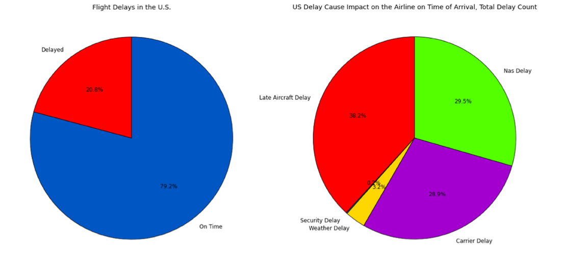
Figure 1.: a) Illustration of the number of delayed and on-time flights in the U.S. (left panel) b) Pie chart depicting the causes of flight delays. Data from August 2014 are shown (%). (right panel)
About 21% arrive late at their destination. Late arrival of a previous flight with the same aircraft (Late Aircraft Delay) is the most frequent cause of flight delay with 38.2%. Delays attributable to the National Aviation System (Nas Delay, 29.5%) and airlines (Carrier Delay, 28.9%) comprise the majority of the remaining delays. Extreme weather conditions delaying or preventing on time departure/arrival is only the cause in 3.2% of the cases. Delays due to evacuation of a terminal or other security related circumstances form the smallest group. It would be great to have data available which would allow to analyze the underlying cause for delays associated with the carrier (Late Aircraft Delay and Carrier Delay) in more detail.
To identify airlines and airports with the highest percentage of delayed flight, I grouped the data either by "airport" or "carrier", calculated the number of delayed and total flights for each airport/airline, respectively. Quickly calculate the percentage of delayed flights, return the percentage (perc) and feed the number into the plot function.The code below is written to analyze the share of each airport.
To identify airlines and airports with the highest percentage of delayed flight, I grouped the data either by "airport" or "carrier", calculated the number of delayed and total flights for each airport/airline, respectively. Quickly calculate the percentage of delayed flights, return the percentage (perc) and feed the number into the plot function.The code below is written to analyze the share of each airport.
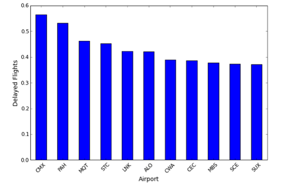
Figure 2.: Bar graph showing the proportion of flights arriving delayed. Airports ranking 1-10 are shown.
So far I have mostly talked about delayed flights, but there are also a number of occurrences where flights are cancelled all together. Envoy Air (MQ) has the worst performance, closely followed by SkyWest Airlines (OO) and Eva Air (EV). All numbers have to be normalized for the total number of arriving flights in order to identify the airline with the highest percentage of cancelled flights. I just quickly ran the data through a slightly modified version of the function above:
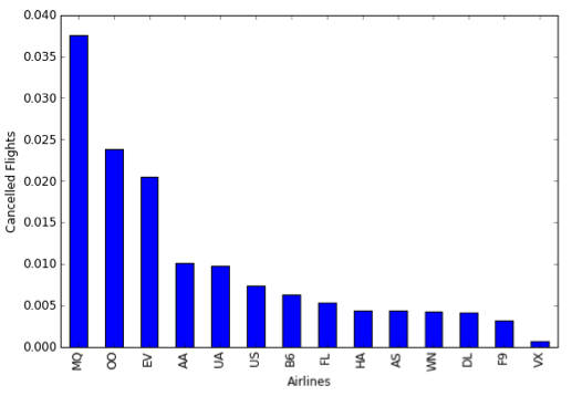
Bar graph showing the proportion of flights cancelled in August
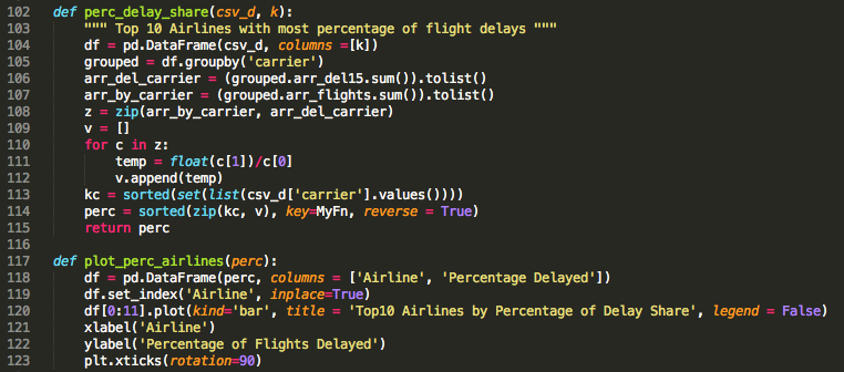
Based on the analyzed data, the airline of choice in order to avoid flight delays in Hawaian Airlines. With a flight delay rate of just above 0.05 percent (369 delayed flights out of 6811 flights), this is 5-fold reduced compared to airlines such as Envoy Air (MQ) and American Airlines (AA).
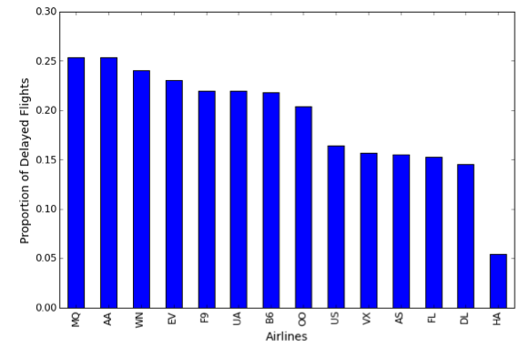
Bar graph depicting the proportion of flights arriving delayed for different airlines
We can compare the underlying causes for the delay in flights for each airline. I decided to look at the three airlines with the highest proportion of delayed flights: AA, MQ, and WN. While AA and MQ show fairly similar ratios between the five different groups, airline WN seems to have a different causation pattern. We would need to apply some statistics in order to be able to conclude if the data provides convincing evidence that there is a real difference.
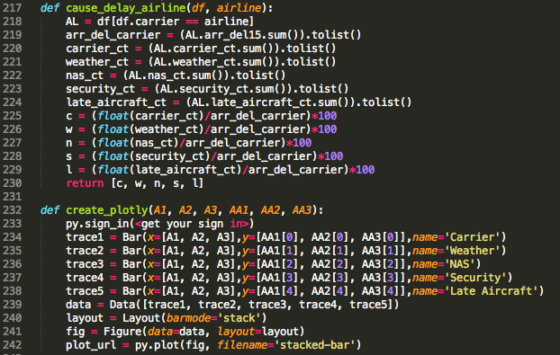
Standardized segmented bar plot depicting the causation pattern for flights delays. Three selected airlines are shown.
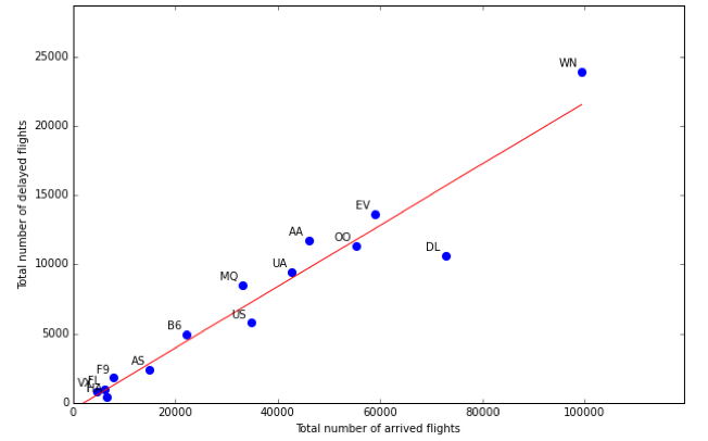
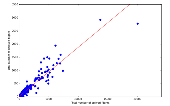
Next, I was wondering whether there is an association between the total number of delayed flights (variable 1) and the total number of arriving flights (variable 2). Scatterplots are one type of graph used to study the relationship between two numerical variables. The scatterplot created from the flight data suggested a linear relationship between the two variables. It appears that the larger the number of arriving flights, the larger is the number of delayed flights (positive association). Airlines with a higher number of arriving flights tend to have higher numbers of delayed flights.
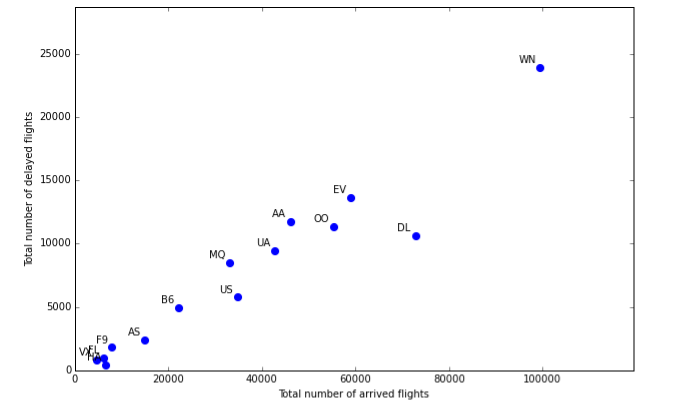
A scatterplot showing the total number of delayed flights against the total number of arrived flights for each airline
Linear models can be used for prediction or to evaluate whether there is a linear relationship between two numerical variables. Linear regression assumes that the relationship between two variables, x and y, can be modeled by a straight line. In order to investigate the presence of a linear relationship among my two variables (here: # arriving flights and # delayed flights), I applied a simple linear regression analysis:
Number of delayed flights = response variable y(i)
Number of arriving flights = predictor variable x(i)
Based on the scatterplot shown below, there seems to be a strong upward linear trend between the two variables. It has to be analyzed if data points WN and DL represent outliers and influence the least squares line.
A scatterplot showing the total number of delayed flights against the total number of arrived flights for each airline.
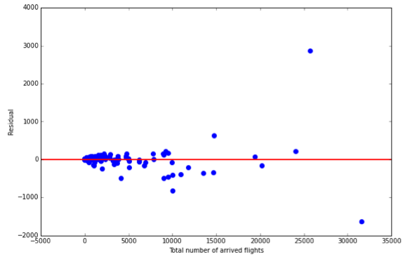
Next, I analyzed the difference between the observed response and the predicted response by computing the residual. Sometimes by plotting the residual new characteristics and patterns can be identified. In this case, no obvious pattern is revealed. The residuals seem to be scattered randomly around the red line which represents 0.
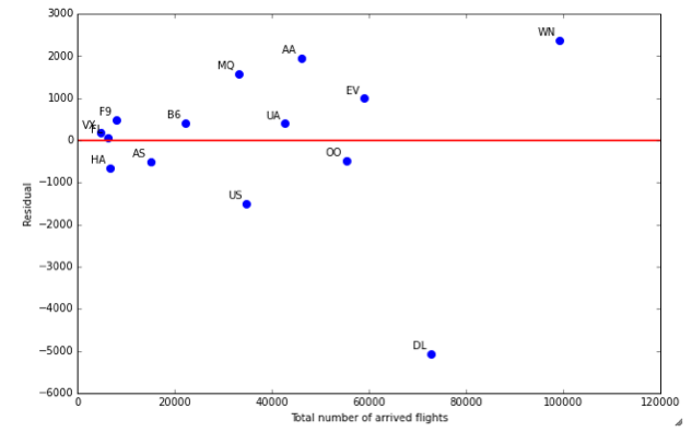
Residual plot for the model shown in the scatterplot above
|
Lets quantify the strength of the linear relationship between the two variables by calculating correlation R. If the relationship is strong and positive, the correlation will be near +1. Using the following formula from the statistical functions of the scipy module : R = pearsonr(x, y) --> 0.96135611323439762.
In addiiton, I used a forward loop and calculated R using mean and std (see code on the right). |
|
For completeness, I also plotted all variable pairs (without calculating the sum for each airline). Each dot represents the total number of arriving flights for one airline at a specific airport and how many flights of these arriving flights were delayed. Much of the data clusters around 0 relative to larger values in the data set. In this case rescaling might make it easier to model the data.
A scatterplot showing the total number of delayed flights against the total number of arrived flights. Each point corresponds to a specific airline serving a specific airport
Using a slightly modified code, you can visualize different variables in a scatter plot in order to get a first idea of the existing (or non-existing) relationship between the two variables. The scatter plot below visualizes the relationship between the total number of arriving flights and delayed flights at a specific airport.
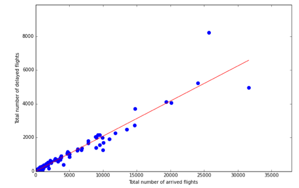
Scatterplot of the total number of arriving flights versus the number delayed flights at a specific airport
Residual plot of the airport model
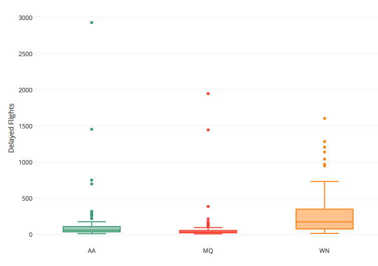
I am just starting to work with plotly and thought trying a box plot to summarize some of my flight data is a good way to begin. Using different types of graphs to visualize your data allows you to better understand your data. For example scatter plots of two numerical variables provide information regarding a possible relationship and histograms provide a view of data density (skewing, modality). Box plots summarize the data while also plotting unusual observations (outliers). The box plot below visualizes the total number of delayed flights at different airports for three different airlines (AA, MQ, and WN).
Things you can read from a box plot:
1. Median (splits data in bottom 50% and top 50%)
2. Q1 (first quartile, 25th percentile)
3. Q3 (third quartile, 75th percentile)
4. Interquartile range (IQR, Q3 - Q1; 50% of the data)
5. Whiskers (max value = 1.5 * IQR)
Any data point lying outside the whiskers are labelled with a dot in order to help identify any outliers ( = observations that appear to be unusually distant from the rest of the data). For each airline, we have a number out data points which aren't reached by the whiskers and as such are unusually distant from the rest of the data. Based on the regression analysis above, we do know that the number of delayed flights is positively associated with the total number of arriving flights at the same airport. When looking at the box plot illustrating the total number of arriving flights for the same airlines, the patterns looks quiet similar. American Airlines had nearly 13000 flights arriving at Dallas airport in August 2014 of which about 3000 flights arrived with a delay of at least 15 minutes.
Box plot of the total number delayed flights at different airports for three airlines
|
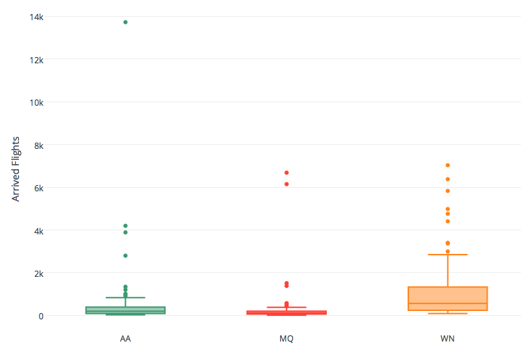
Box plot of the number of arriving flights at different airports for three airlines
|
In general, analyzing these plots carefully allows you to identify data collection or entry errors ( I re-evaluated that AA has ~14000 arrivals at one airport), identifying a skew in the data, and providing insight into interesting properties of the data. For example, it identifies Dallas/Fort Worth as a central hub of American Airlines and points to a relationship/association between the two variables.
Overall, normalizing the number of delayed flights by the number of total flights seems to be a good way to compare the on-time performance of a specific airline between different airports. I quickly did it for American Airlines. Two data points which lie outside the IQR stick out right away:
1. ~45% of all arriving flights delayed --> BHM (Birmingham; 25 out of 56 flights delayed)
2. ~7% of all arriving flights delayed --> LIH (Lihue; 4 out of 53 flights delayed)
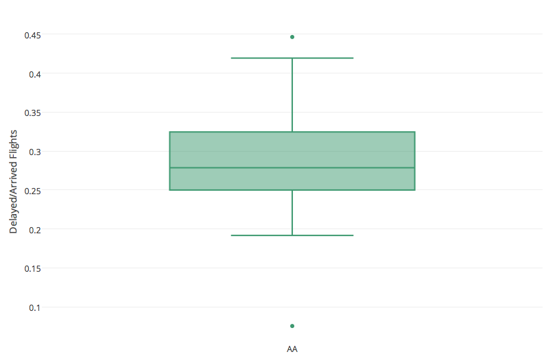
Box plot of the number of delayed flights as percentage of total flights for AA
|
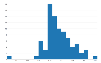
Histogram of the same data
|
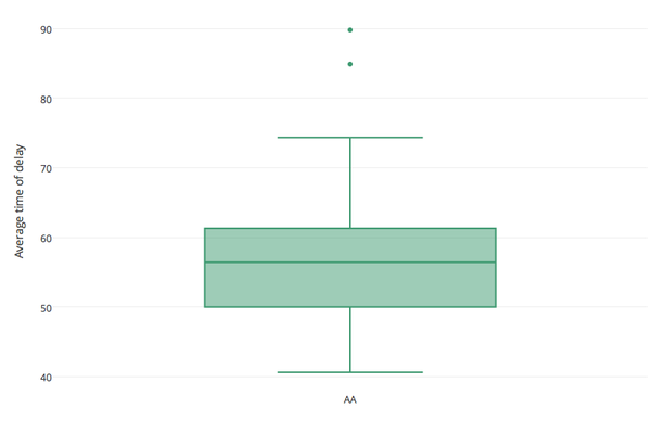
Lastly, I analyzed the average time of delay for American Airlines. Based on my box plot (see blow), two different the average delay time for passengers were unusually long at two airports: HNL(~90 minutes) and XNA (~75 minutes).